
Drawing Calendar Heatmaps with Matplotlib
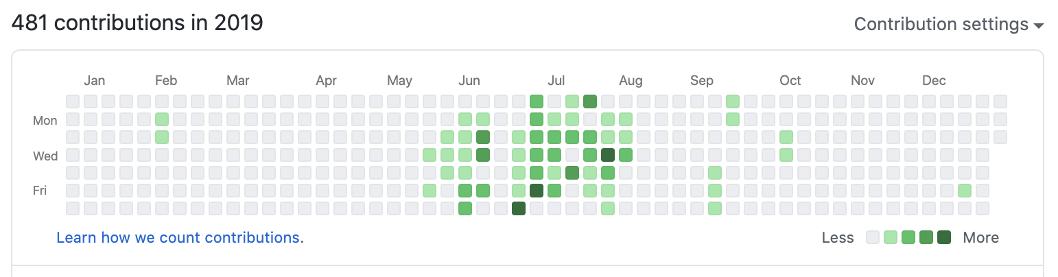
Calendar heatmaps are familiar to anyone with a GitHub repository–the green gridded chart that tracks contributions over time is an example of one. They’re a great way to visualize time series data, and different layouts can reveal different temporal patterns. Most commonly, the layout is structured to reveal periodic behavior, e.g. coding activity per day of the week, over the weeks of a year. Another beautiful example is this visualization of music listening habits per hour and day of the week by Martin Dittus.
Calendar heatmaps can also be used to visualize change points. For instance, this one shows the annual number of cases of measles and other infectious diseases across the United States over time. Given additional context about when a vaccine was introduced for each disease, a pattern emerges showing that disease prevalence is dramatically lower about 5-10 years afterwards.
There are a number of tutorials and libraries available for generating these types of figures in R (using ggplot2 or calendarPlot), Tableau, JavaScript (using d3 or Cal-Heatmap), and Python (using calmap or plain old matplotlib). I use Python for most of my work, but also wanted to try to recreate something that looks close to the GitHub contribution calendar in style without relying on a separate package.
Data I Used
I first had the idea to create this type of visualization when I decided to access my data from Untappd, an app I use with my friends to check in beers. I also use MapMyRun (and now Strava) to track my progress on runs. Both of these apps allow users to export their data for a reasonably small fee ($5 to become an Untappd “Supporter” and $6 to become a MapMyRun “MVP” for 1 month).
Code
I decided to represent a year as a 7xW array, where 7 corresponds to number of days in a week, and W represents the number of weeks a year spans. W is either 53 or 54, depending on whether the year in question is a leap year, and what day of the week the year starts. In order to handle either case, I decided to use W=54, and populate the array with values only at the positions corresponding to days in the query year.
# A year can span at most 54 weeks
year_array = -1*np.ones((7,54)) # -1 will denote days that are not part of the query year
Next, I needed an array of size 1xD containing the values to display in the heatmap, where D represents the number of days in the query year. This step varies a little based on the form the data is exported in. For example, this is how I construct this array from my Untappd export:
def is_leap_year(year):
    if not year%100 == 0: # Not a century year
        if year%4 == 0:
            return True
        else:
            return False
    else: # Century years must be divisible by 400 to be leap years
        if year%400 == 0:
            return True
        else:
            return False

def get_untappd_checkin_dates(untappd_data_dict):
    return [checkin['created_at'] for checkin in untappd_data_dict]

def get_checkins_per_day_of_year(year, checkin_dates, datetime_format='%Y-%m-%d %H:%M:%S'):
    if is_leap_year(year):
        checkins_per_day = np.zeros((1,366))
    else:
        checkins_per_day = np.zeros((1,365))

    for cd in checkin_dates:
        cd_year = datetime.datetime.strptime(cd, datetime_format).year
        if cd_year == year:
            cd_dayofyear = datetime.datetime.strptime(cd, datetime_format).timetuple().tm_yday
            checkins_per_day[0, cd_dayofyear-1] += 1

    return checkins_per_day
untappd_data = json.load(open('path/to/my_untappd_beer_export.json', 'r'))
untappd_checkin_dates = get_untappd_checkin_dates(untappd_data)
Next, I populate the year array. There’s almost certainly a cleverer way to do this by reshaping the 1xD array of checkins, but computing the year array row and column positions made the most sense to me.
if is_leap_year(year):
    num_days_in_year = 366
else:
    num_days_in_year = 365

# Get day of the week of January 1st
jan1_dow = datetime.datetime(year, 1, 1).timetuple().tm_wday

# For each day of the year, find its position in year_array and populate with number of checkins for that day
for i in range(num_days_in_year):
    rownum = (i+jan1_dow)%7
    colnum = int((i+jan1_dow)/7)
    year_array[rownum, colnum] = checkins_per_day_of_year[0,i]
I also need to create a colormap that will color -1 values white, 0 values light gray, and all other values according to a colormap. I used matplotlib.colors.ListedColormap to achieve this:
num_colors_needed = len(np.unique(year_array[:,:]))
colors = [(1, 1, 1), # white, not a day of the year
          (0.95, 0.95, 0.95), # gray, no checkins
          (0.95, 0.9, 0.5), (0.95, 0.8, 0.3), (0.9, 0.8, 0), # <= 7 checkins per day
          (0.9, 0.5, 0), (0.8, 0.4, 0), (0.6, 0.3, 0), (0.4, 0.2, 0.2)]
assert len(colors) >= num_colors_needed, 'Need to specify more colors!'
cm = ListedColormap(colors[:num_colors_needed])
Lastly, I used pcolor to plot the year array:
# Plot
fig = plt.figure(figsize=(15,2), constrained_layout=True)
ax1 = plt.gca()
c = ax1.pcolor(year_array, edgecolors='w', linewidths=4, cmap=cm)
ax1.set_aspect('equal')

# y-axis
ax1.invert_yaxis() # top row corresponds to Monday
ax1.set_yticks([0.5, 1.5, 2.5, 3.5, 4.5, 5.5, 6.5]) # position labels
dow = ['M', 'Tu', 'W', 'Th', 'F', 'S', 'Su']
ax1.set_yticklabels(dow)
plt.ylim(7,0)
plt.ylabel('%s'%year, fontsize=16)

# x-axis
# Calculate which week each new month starts to get positions for xticks
month_start_weeks = [0]
if num_days_in_year == 365:
    month_lengths = [31, 28, 31, 30, 31, 30, 31, 31, 30, 31, 30, 31]
else:
    month_lengths = [31, 29, 31, 30, 31, 30, 31, 31, 30, 31, 30, 31]
for m in range(1, len(month_lengths)):
    month_start_weeks.append(int((sum(month_lengths[:m]) + jan1_dow + 1)/7))
ax1.set_xticks(month_start_weeks)
ax1.set_xticklabels(['Jan', 'Feb', 'Mar', 'Apr', 'May', 'Jun', 'Jul', 'Aug', 'Sep', 'Oct', 'Nov', 'Dec'], ha = 'left')

# Good datavis practice: remove unnecessary ink
ax1.spines['top'].set_visible(False)
ax1.spines['right'].set_visible(False)
ax1.spines['bottom'].set_visible(False)
ax1.spines['left'].set_visible(False)

# Add legend
if draw_legend:
    legend_elements = [Patch(facecolor=colors[2], edgecolor=colors[2], label='1'),
                        Patch(facecolor=colors[3], edgecolor=colors[3], label='2'),
                        Patch(facecolor=colors[4], edgecolor=colors[4], label='3'),
                        Patch(facecolor=colors[5], edgecolor=colors[5], label='4'),
                        Patch(facecolor=colors[6], edgecolor=colors[6], label='5'),
                        Patch(facecolor=colors[7], edgecolor=colors[7], label='6'),
                        Patch(facecolor=colors[8], edgecolor=colors[8], label='7'),]
    ax1.legend(handles=legend_elements, loc='upper left', bbox_to_anchor=(1, 1.1), frameon=False, title=legend_title)

plt.show()
Output
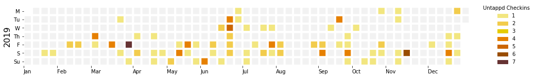
Looking at my Untappd checkins from 2019, it’s easy to spot Friday happy hours, the week in June I went to Nashville, TN (visiting lots of bars to see local bands), the weeks in August leading up to deadlines, and the weeks in November and December I was visiting my parents and working towards my PhD proposal.
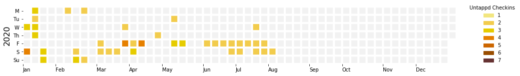
By contrast, this year I’ve been in lockdown since early March, and the weeks since then have looked mostly the same. Thankfully, my friends and I still get together for virtual happy hours.
For my run distances, I wanted to use a continuous colormap rather than the discrete, manually-coded colormap I used for Untappd.
num_colors_needed = int(np.ceil(year_array.max()))+1
colors = matplotlib.cm.get_cmap('Oranges', num_colors_needed)
cm = colors(np.linspace(0, 1, num_colors_needed))
cm[0,:] = np.asarray([1, 1, 1, 1])
cm[1,:] = np.asarray([0.95, 0.95, 0.95, 1])
cm = ListedColormap(cm)
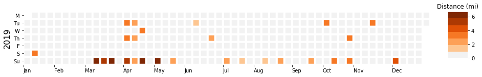
I can see exactly when I started trying to run regularly again in spring 2019, and when I cut back again after a knee injury in May. I can also see that I need to do much better this year!
Hopefully these snippets are useful to someone else! If you have any questions or feedback, please don’t hesitate to get in touch.